
Lesson 06
How to Avoid AI Slop in Vibe-Coded Landing Pages
Overview
A practical design-quality workflow for avoiding generic AI-generated landing pages. The lesson breaks down the visual tells that make pages feel like AI slop, including lazy selected states, oversized eyebrow labels, random status pills, glow lights, weak pricing sections, default fonts, and visuals that do not match the product.
The fix is a repeatable loop: stop prompting from zero, use screenshots and reference URLs, add AGENTS.md and DESIGN.md guidance, generate contextual media, apply skills, critique specific UI mistakes, and turn the strongest result into reusable design rules.
Vibe-coded landing pages start to feel like AI slop when the model is asked to invent the product, layout, taste system, media, and polish from a blank prompt. The result may look complete, but the details often expose the shortcut: oversized eyebrow labels, random status pills, purple glow gradients, default fonts, weak pricing sections, mismatched visuals, and generic illustrations.
This lesson is about building a better taste loop. Instead of accepting the first generated page, you use references, reusable rules, DESIGN.md, skills, contextual images, generated video, and precise design vocabulary to steer the output toward something that feels designed.
The workflow is:
spot the weak patterns -> name the design issue -> add references and rules -> replace generic media -> fix specific sections -> save the working system
Use this process when a generated landing page has the right structure but still feels familiar, generic, or visually disconnected from the product.
Why Do Vibe-Coded Landing Pages Start To Look Like AI Slop?
The problem is usually not one bad model. It is the combination of vague prompting, default visual habits, and a missing design standard. A page can have a hero, feature grid, pricing section, FAQ, and CTA while still feeling generated because the visual decisions are too predictable.
Look for repeated tells:
- oversized eyebrow labels that do not add meaning
- random pills, badges, and status dots
- glow lights and gradients that do not support the product
- default fonts and weak type hierarchy
- generic illustrations or images that could belong to any startup
- pricing sections with poor contrast, spacing, or conversion hierarchy
Once you can name the pattern, you can ask Aura to fix the specific issue instead of asking for a vague improvement.
Why Do Model Taste Profiles Matter?
Different models have different taste profiles. One may be better at close reproduction, another at visual polish, and another at animation or creative exploration. The lesson compares that behavior because prompting still matters even when the model is strong.
The point is not to memorize which model always wins. It is to understand the job you are asking the model to do. A model that creates a dramatic first pass can still need help with spacing, color restraint, icon choices, or product-specific media.
Before deciding that a page is finished, compare:
- whether the typography feels intentional
- whether the color system matches the product
- whether images and illustrations belong to the story
- whether cards, buttons, and pricing have enough hierarchy
- whether the page feels original rather than assembled from common AI patterns
The better your critique vocabulary becomes, the more useful every model becomes.
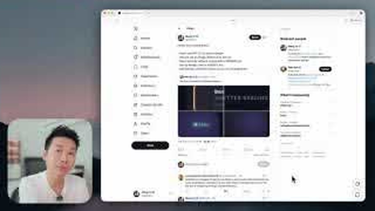
How Do References Make Prompting Less Random?
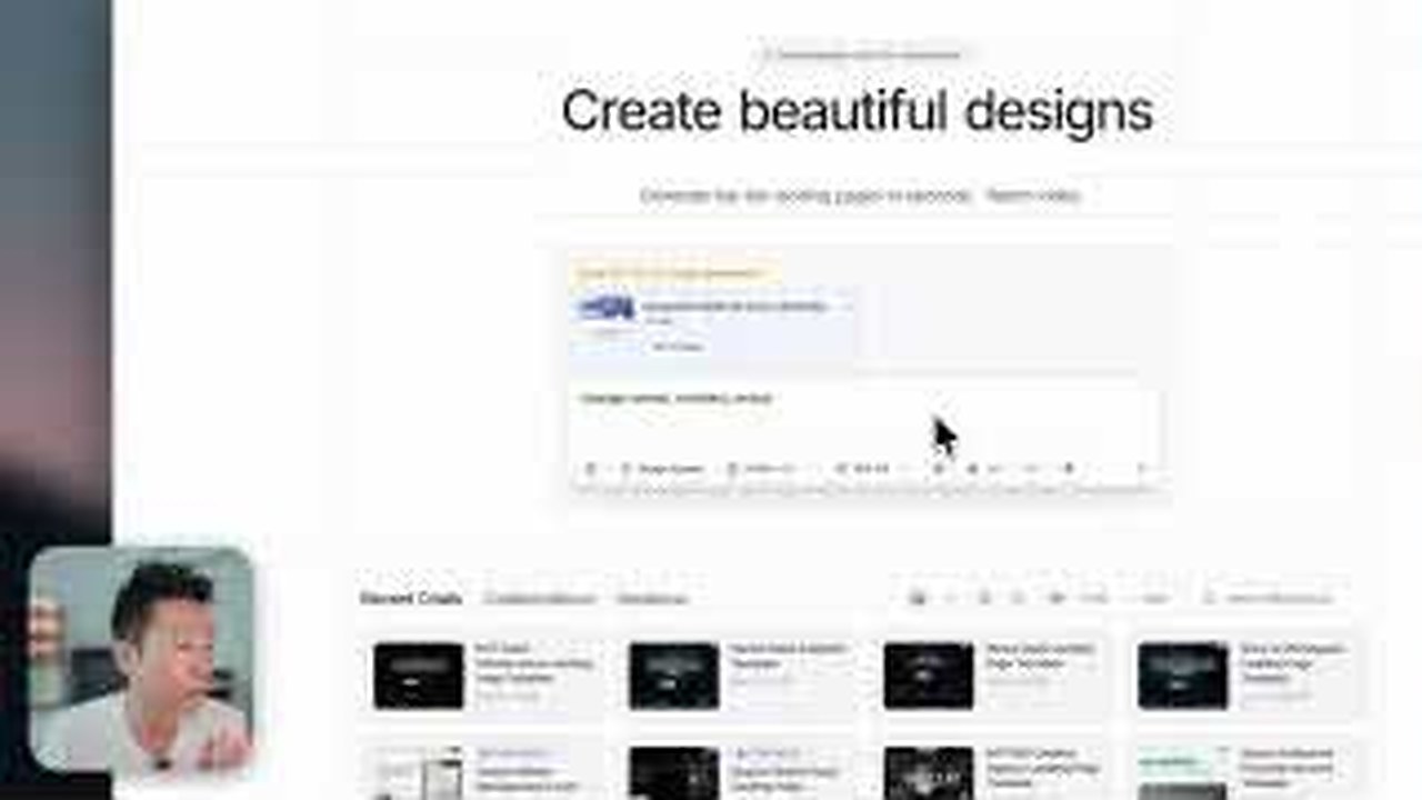
The biggest fix is to stop prompting from zero. Screenshots, reference URLs, AGENTS.md rules, DESIGN.md files, and component examples give the model something concrete to follow. They create a taste floor before the first generation appears.
References should not be used as a copy-and-ship shortcut. Use them to explain structure, density, typography, interaction, and visual energy, then change the product, brand, copy, media, and composition so the output becomes original.
Good reference prompting is specific:
- import a URL when you need structure and visual context
- use screenshots when composition is hard to describe
- put reusable product rules into AGENTS.md
- attach DESIGN.md when the page needs consistent visual DNA
- ask the model to change the brand, colors, sections, and media instead of cloning the source
This gives Aura clearer constraints and reduces the chance that it falls back to generic landing-page habits.
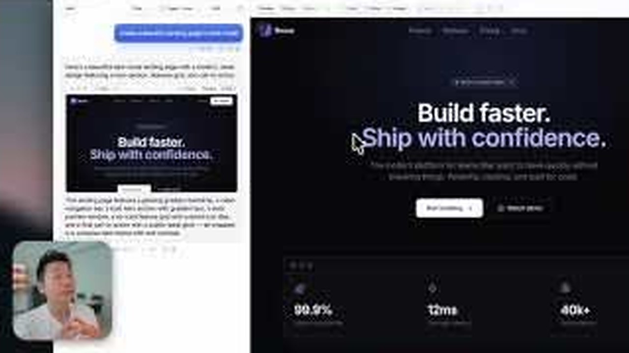
How Do Contextual Images And Video Replace Generic Media?
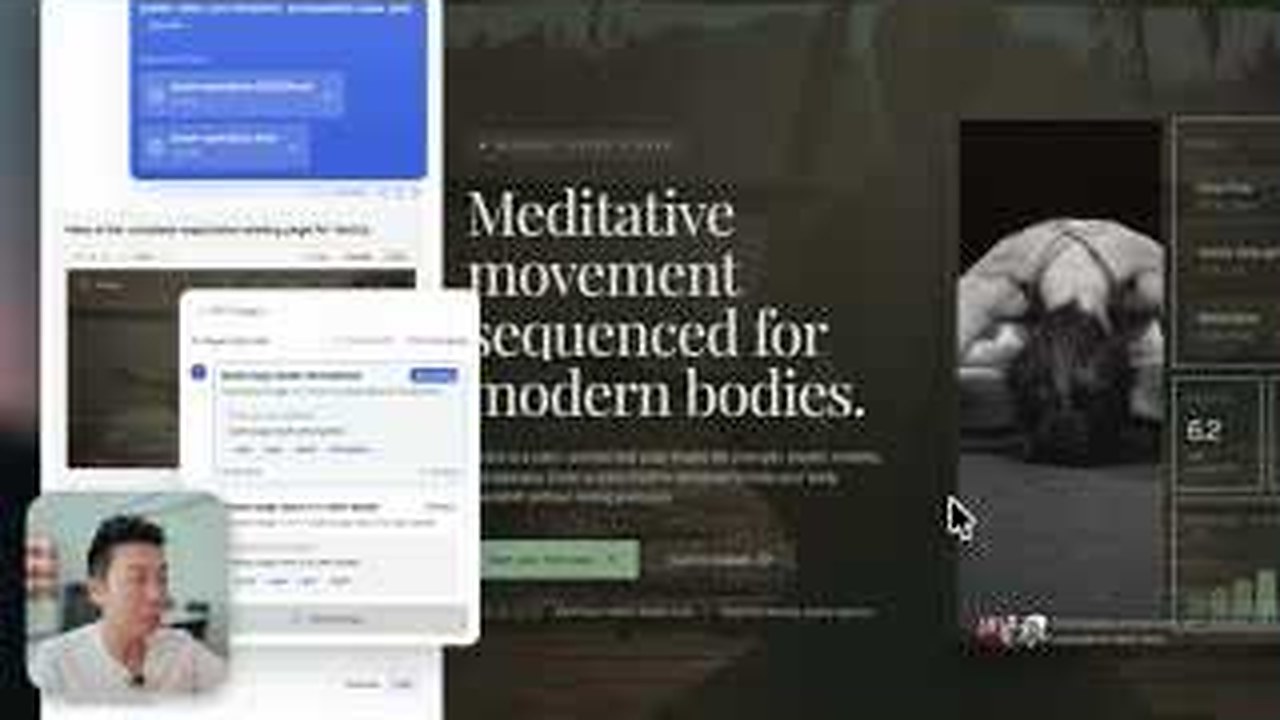
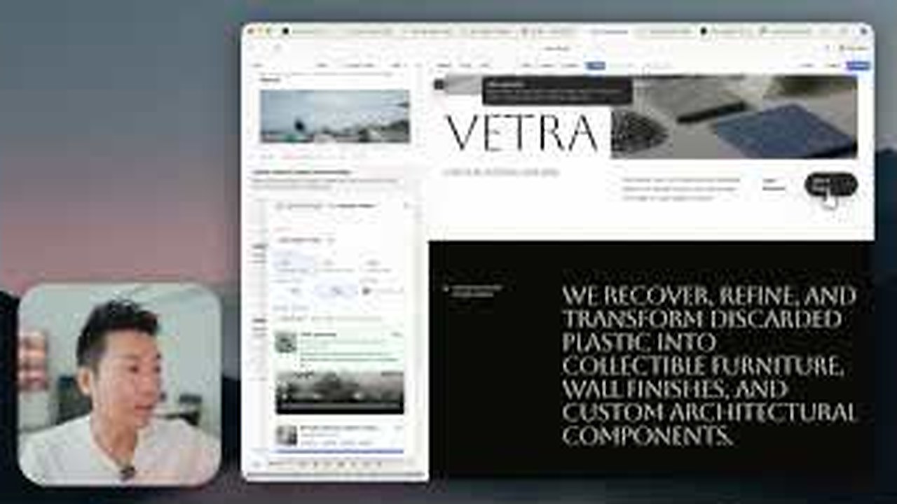
Generic visuals are one of the fastest ways to make an AI page feel unfinished. If the imagery could fit any productivity app, design agency, AI tool, or SaaS dashboard, the page has not earned its visual identity yet.
The workflow replaces that weak media with product-specific image generation. Instead of asking for one hero image, create a small media system that fits the actual sections: hero, features, use cases, social proof, product screenshots, background motion, and final CTA.
Use generated video only where motion helps:
- a background moment that adds atmosphere without hiding copy
- a product interaction that is easier to understand in motion
- a hover or loop behavior that supports the section
- a hero visual that needs life without becoming distracting
The goal is not more media. The goal is media that makes the product feel specific.
How Do You Fix Specific UI Mistakes?
The lesson is practical about refinement. Do not accept the first pass because it looks impressive at a glance. Open the page like a designer and name the small mistakes.
Instead of "make this better," ask for changes such as:
- remove generic illustrations and use product-specific media
- reduce the glow and make the contrast cleaner
- make the pricing cards easier to compare
- improve button hierarchy and padding
- use a more original icon system
- fix borders, gradients, shadows, and section spacing
- improve responsive polish so the mobile view does not feel like an afterthought
Specific critique keeps the model focused. It also helps you decide which fixes are faster to do manually and which ones are worth another generation pass.
How Do You Turn The Workflow Into Reusable Design Rules?
Once a page finally works, do not leave the taste inside that one project. Turn it into reusable guidance. A good result can become a DESIGN.md file, a component reference, a skill, or a project rule that helps the next generation start at a higher level.
Capture the decisions that made the page feel designed:
- type scale and font direction
- color and contrast rules
- button and card treatment
- image and video behavior
- section rhythm and spacing
- pricing, CTA, and responsive patterns
- motion rules and effects that should be reused
That is the bigger lesson. Avoiding AI slop is not about one perfect prompt. It is about building a repeatable design loop: references, rules, generation, critique, media replacement, precise fixes, and reusable systems.