
Lesson 02
Design to Website in Aura: Build a Brutalist Landing Page
Overview
A design-to-website workflow for building a brutalist landing page in Aura from an existing visual reference. The lesson walks through different ways to start, then uses an image attachment, Prompt Builder instructions, animation skills, and Aura Asset Image to create the first draft.
The workflow is intentionally iterative rather than one-shot. After the first draft, the page is refined through copy edits, animation fixes, manual adjustments, missing sections, image updates, and navigation links so the result becomes a working landing page instead of a static reproduction.
A brutalist landing page is easier to communicate with a visual reference than with style words alone. This lesson uses an existing design reference in Aura, then turns it into a working landing page through Prompt Builder instructions, GSAP animation skills, Aura Asset Image, manual edits, and final navigation polish.
The workflow is:
reference -> start method -> starter prompt -> first draft -> animation fixes -> sections, images, navigation
Use this when you want to move from a strong static design direction to an actual website.
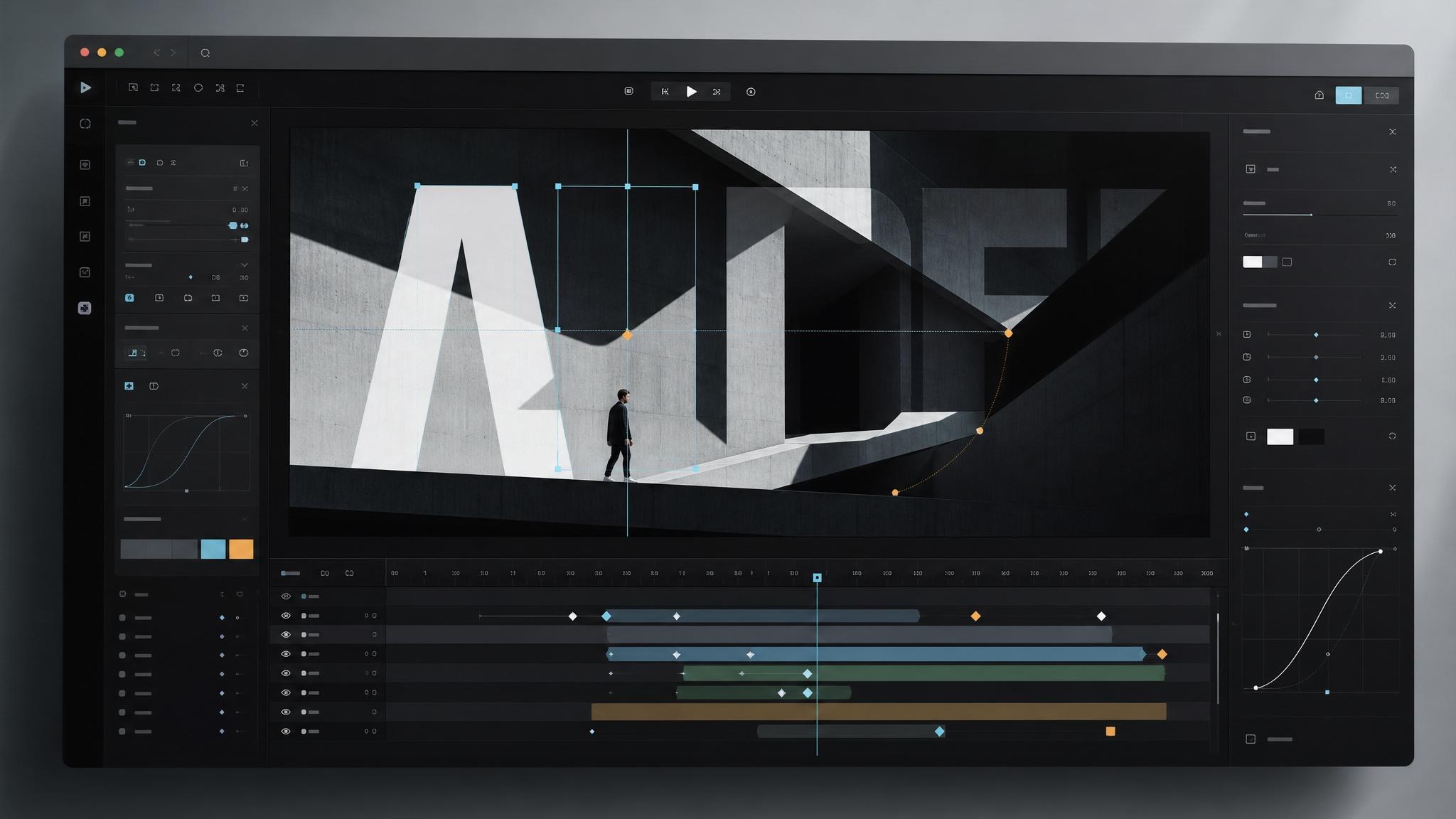
How Should You Use A Brutalist Design Reference?
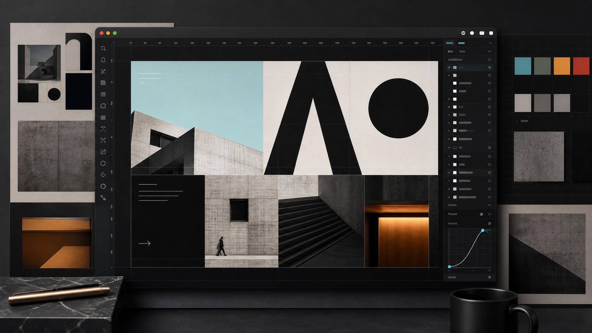
The reference gives Aura a visual target for scale, contrast, layout rhythm, and editorial energy. Brutalist design depends on proportion and structure, so showing the model the direction is more useful than only saying "make it brutalist."
The goal is not to copy the reference directly. Use it to explain the language of the page:
- bold typography
- sharp spacing
- strong grid blocks
- high-contrast sections
- confident image treatment
- direct, raw visual rhythm
Then change the product, copy, assets, and interaction so the page becomes its own design.
Which Aura Starting Path Should You Choose?
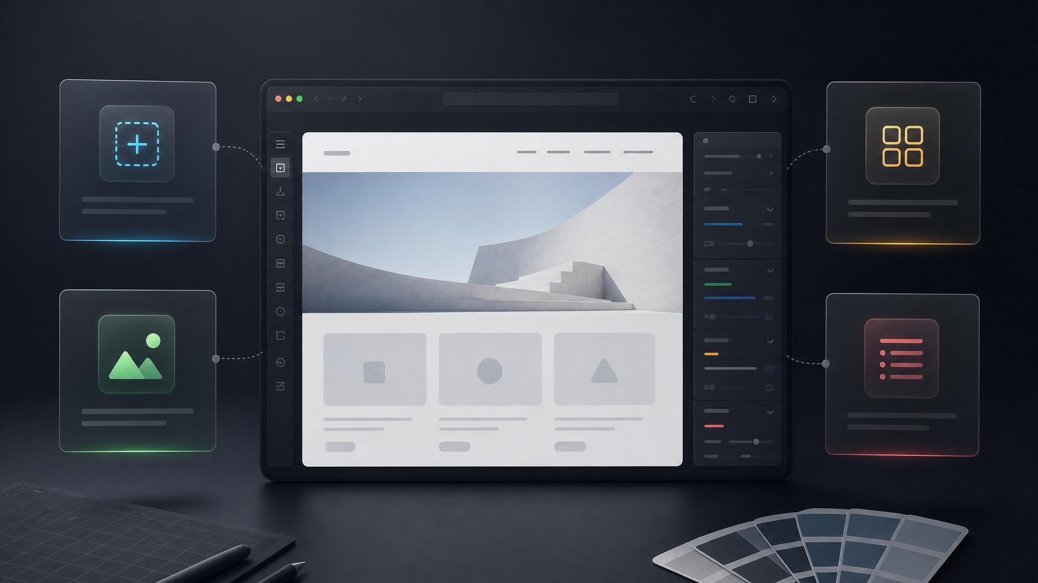
The video walks through different ways to begin a project in Aura. That choice matters because each input gives the model a different kind of context.
For a design-to-website workflow, an image attachment is especially useful. It shows composition, density, and type scale that would be difficult to describe precisely in text.
Use the starting method that matches what you have:
- use a blank prompt when the idea is mostly verbal
- use a template when the structure already exists
- use an image reference when the visual composition is the point
- use Prompt Builder when the request needs stronger organization
What Goes Into The Starter Prompt?
The starter prompt combines the design reference with instructions for the landing page, animation direction, and image generation. This gives the first draft a better chance of feeling intentional.
Good starter prompts define:
- the page purpose
- the brutalist visual direction
- sections the page should include
- animation or GSAP behavior
- image and asset needs
- what should change from the reference
The prompt is not only a style request. It is a production brief.
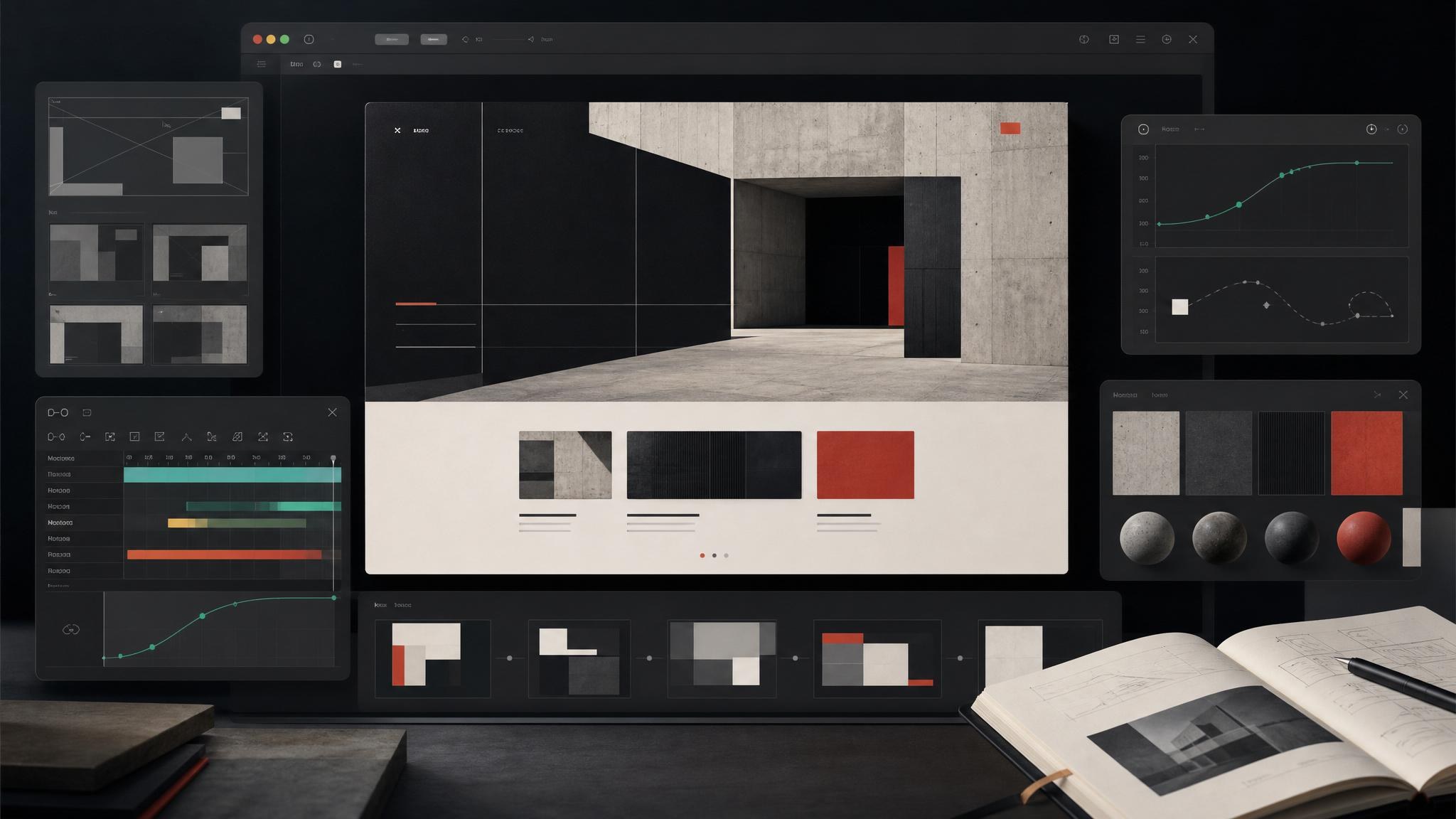
How Do You Review The First Draft?
The first draft is a starting point. Review it against both the reference and the website goal. A page can capture the mood while still missing important details like hierarchy, section completeness, copy quality, or motion behavior.
Look for specific fixes:
- copy that feels too generic
- animation that does not match the style
- sections that are missing or too thin
- images that do not fit the page
- navigation that is not connected yet
Specific critique keeps iteration productive.
Why Are Manual Edits Part Of The Workflow?
The lesson fixes the hero title animation and makes manual edits. That is a healthy part of the workflow. Some details are faster to adjust directly than to regenerate through another broad prompt.
Manual edits help preserve the direction while improving precision:
- animation timing
- title behavior
- spacing and alignment
- copy changes
- small UI details
AI generation creates momentum. Manual polish keeps the result controlled.
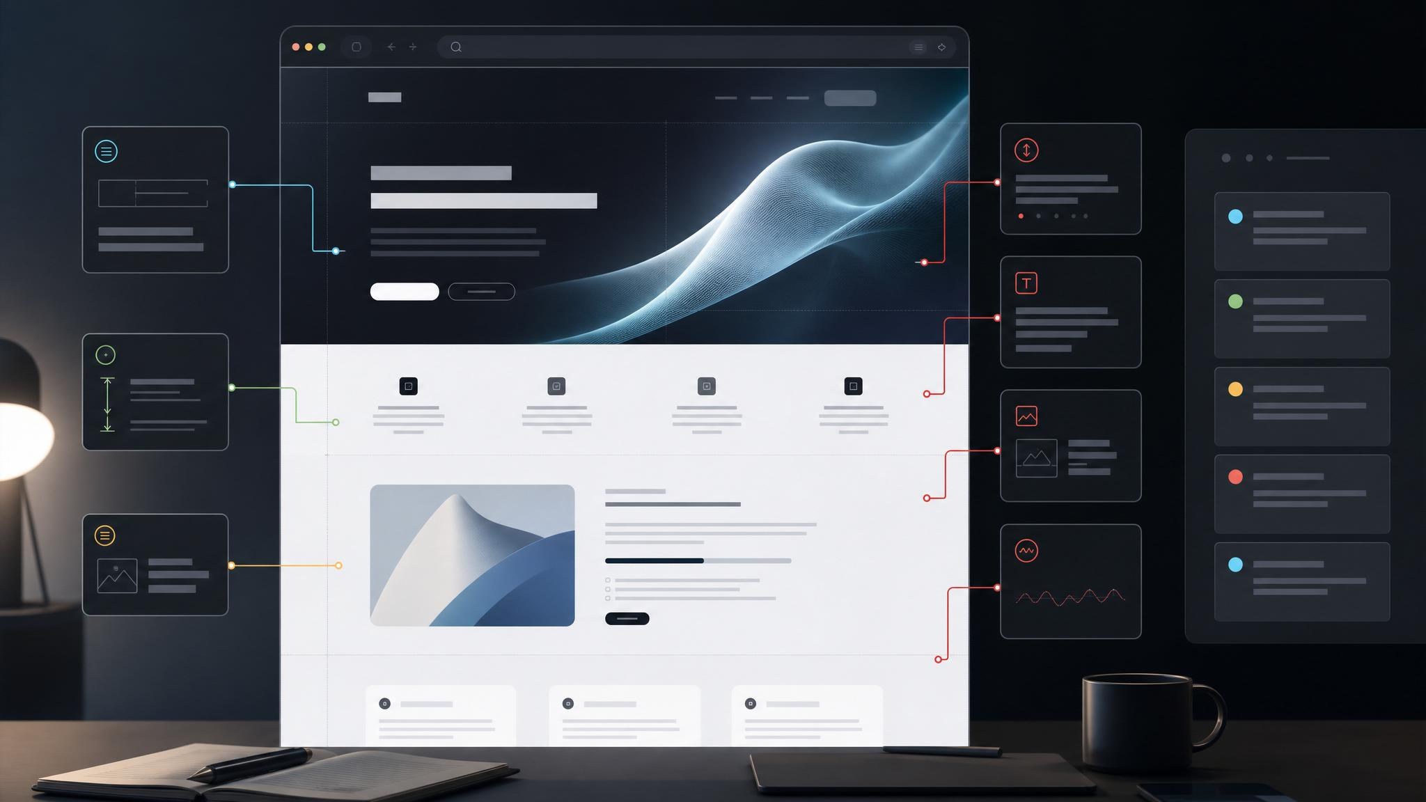
How Do You Finish The Page?
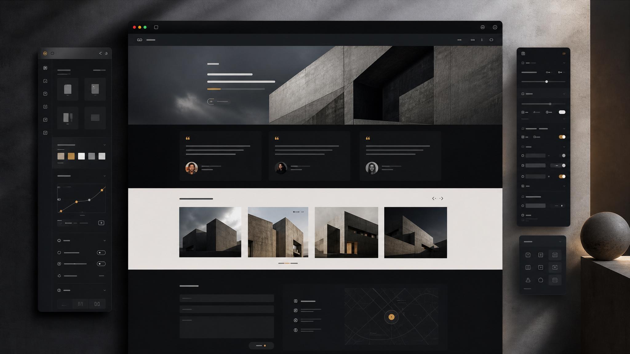
The final steps turn the draft into a working site. The workflow adds testimonials, a contact section, updated images, quote animation, and connected navigation links.
Before calling the page complete, check:
- every major section has a purpose
- images fit the visual system
- animations support the page rather than distract
- navigation links go where users expect
- the final page still carries the brutalist direction
This is the difference between a generated visual and a usable landing page.