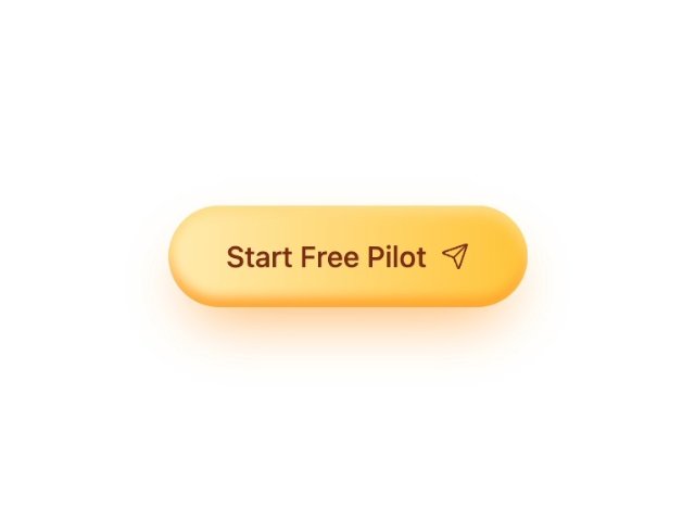
Gradient Launch Button with Icon
3.4k views
6 remixes
Pro
About
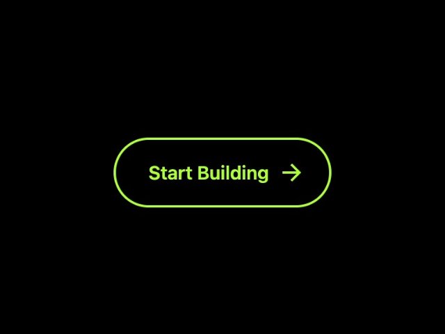
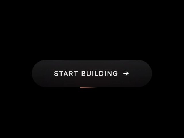
A stylized call-to-action button featuring amber gradient background, hover glow, and zap icon. Uses Tailwind-style utility classes, layered shadows, and active state transform for interactive feedback. Ideal for primary actions like launching or starting workflows.
This is a Pro component. Upgrade to unlock the source code and remix tools.
Created
Nov 24
Updated
Mar 16
Remixes
6
Creator
M
Meng To
View profileTags
More from Meng To
Gradient CTA Button with Icon
PRO4274
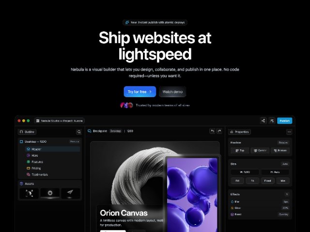
Marketing Hero Section with Animated Gradient CTA
6851
Animated Hover CTA Button with Sliding Text
PRO3517
Responsive Fixed Header with Mobile Slide-in Menu
3583

Dark Hero Section with AI Product Card Grid
PRO3148
Related Components
Animated Dual Call-to-Action Button Set
1630
Gradient Pill Button with Icon
PRO6016
Animated Generate Button with Icon
PRO5184
3D Glassmorphic Gradient Button with Parallax Hover
1623
Animated Gradient Beam CTA Button
PRO7286